
Cookies should be sweet
Digital ones are mostly bitter!

Problem statement
Cookies are central to the modern digital user experience. They enable web analytics, which is foundational for personalisation. Cookies gather data that can help improve page performance. Cookies keep you logged in so that you don’t have to provide your credentials every single time you visit a particular site or app.
But they can also bring your web browsing experience to a jarring, screeching halt.
Enter, “The Cookie Banner”.
The cookie banner is a chore. It’s a toll both you never asked for. It’s an annoying younger cousin who insists on dancing in front of the TV as you try to watch something. It breaks your flow. It is the death of seamless user experience.
It is a legal framework that was designed to give us control and make us feel safe. The execution makes it feel like you are in a hostage situation.
The first-time user experience should not be bitter, especially because of something called “Cookies”.
Let’s design a better cookie experience.


Why do I want to redesign the cookie consent experience?
Motivation
Whilst searching for a gift for a friend, I had one of the worst “cookie days” of my life. It felt like every page I opened came attached with an unscalable cookie wall. At first, I tried to accept and reject the cookies consciously (the “reject all” button wasn’t there).
Then, I broke. I started accepting everything just to get to my webpages faster.
After this, I started noticing people struggling and getting annoyed with cookie consent everywhere: from the milk aisle in Tesco to the waiting area in Starbucks.
Goals
Android products give power to the user. The user chooses which cookies go in the “jar” and which don’t. This point within the user journey creates maximum disruption, friction, and cognitive load for the user. Apple doesn’t have this problem, but I can’t change Google’s policies.
My goal is to design a cookie consent experience that is pleasant, not disruptive, and supports compliance requirements.
Method: a practical evidence-driven approach
Present state: journey, emotion, and the interface
To improve an existing interaction or journey, we first need to understand the present state.
I began by collecting examples of cookie banners. For each example, I considered the same scenario: the user wants to learn something about the organisation and has come to their homepage.
With this context, I thought about how people may feel. An excited shopper clicks through to the Shien homepage, only to be greeted by the cookie wall. A photographer wanting to look at specs on Nikon’s website, only to be greeted by the cookie wall. You get the idea.
I am particularly focused on the layouts, interactions, and content. I also tracked the goods and bads of each example. Sometimes, if I can’t get rid of the bad aspects of an experience, I work on further enhancing the good parts of the experience.
Desk research
I had used observational research to identify and, to an extent, validate the pain-point. I turned to Reddit to establish whether this was even an issue. Reddit did not disappoint. Threads ranged from: “Do Germans hate cookie banners more...” to “Cookie banners suck...”.
The recurring issues
Content assault
The main page loads, and before it can before it can can be consumed, the cookie banner blocks everything. On e-commerce platforms, promotional offers popped up too, adding to the clutter.
The experience is worse on mobile, as the banner completely takes over the screen.
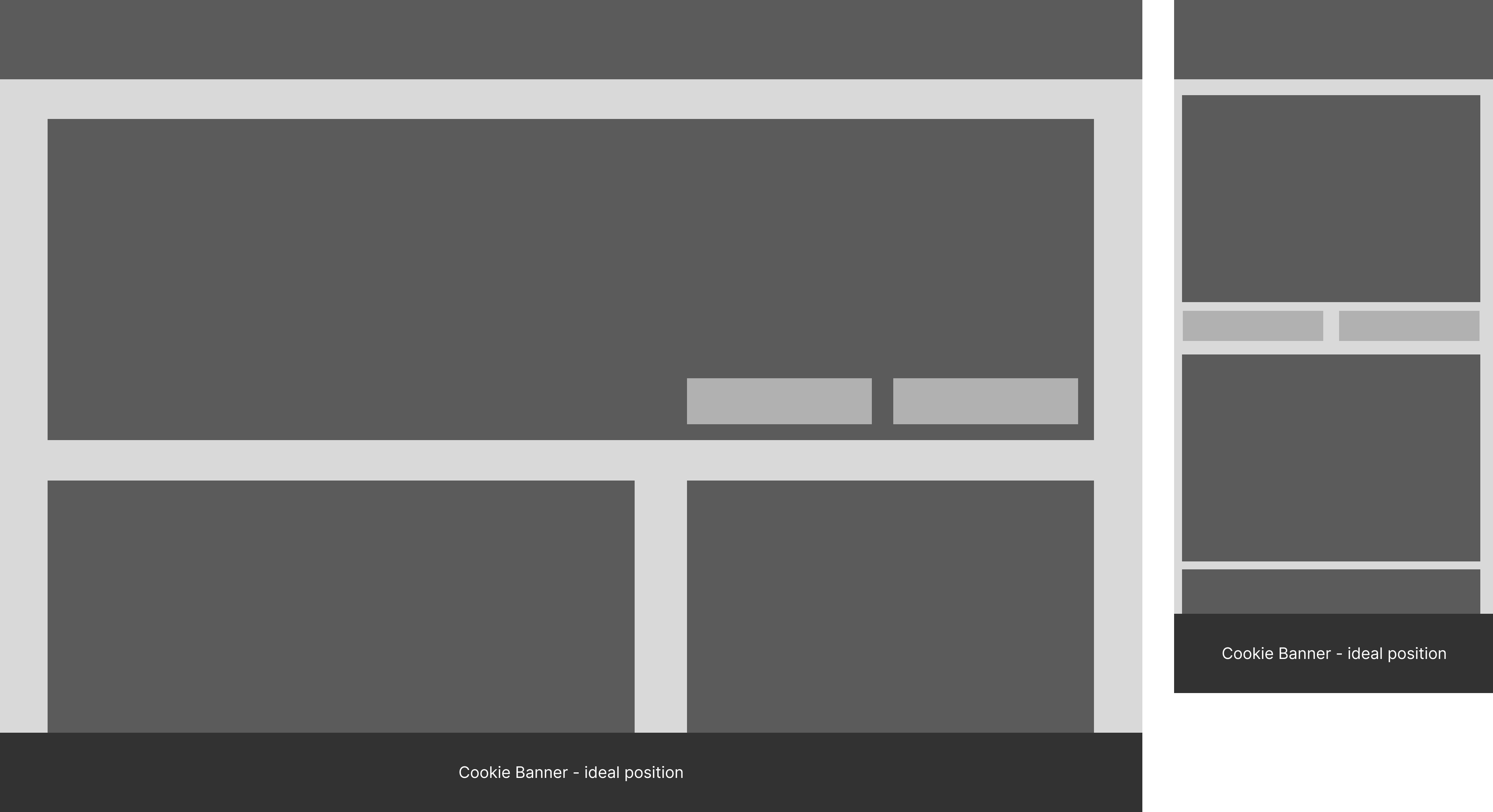
Positioning
Some content banners appear at the bottom of the page. They continue to let the users engage with the content. Visually, they are still not in sync with the rest of the page, but they don’t obstruct.
Lots of banners take centre stage. This really breaks the flow. You forget why you were on the page. Combined with the legal jargon-heavy copy and a multitude of options, I would describe them as coercive.
Buried actions
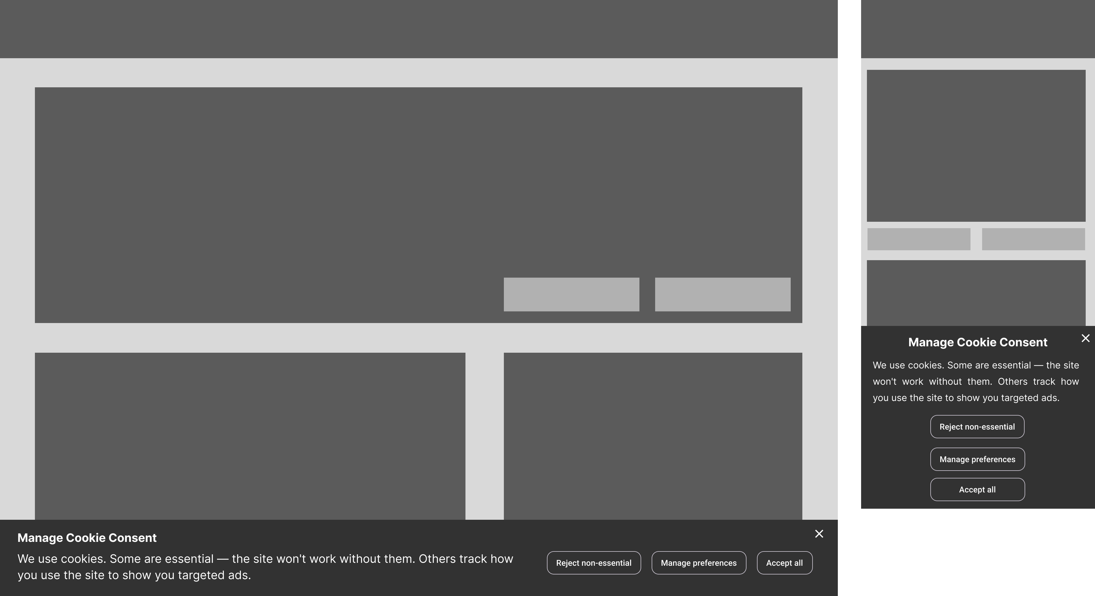
Placing the GDPR compliant “Reject All” button is not enough, as all the buttons tend to have the same weight.
The other aspect is where a user clicks on “manage preferences”. Pre-ticked boxes, convoluted toggle UIs, categories buried under jargon - the interfaces place too much pressure on the user. Everything is designed to make them accept, whilst making it look like they have the power to choose.
Jargon overload
The content is not friendly at any point. Not at the top level, and definitely not at the “manage preferences” level. The technical language creates asymmetry. The site understands what is being asked, but the user doesn’t understand (in most cases).
When people don’t understand what’s happening, they default to the easiest way out. In this case, it is an “Accept All” button.
Low-effort, high-impact interventions
Positioning and power
The cookie banner should never obstruct the main content, visually or in terms of usability. The user should be able to interact before choosing (not choosing = no tracking allowed). The banner across the bottom of the screen works best.
User-centric content writing and design
The copy, from the buttons to the longer passages, should clearly communicate to the user what the impact of an action will be. This will be supported by creating a neutral hierarchy (no action will be visually “louder”).
Copy should be honest
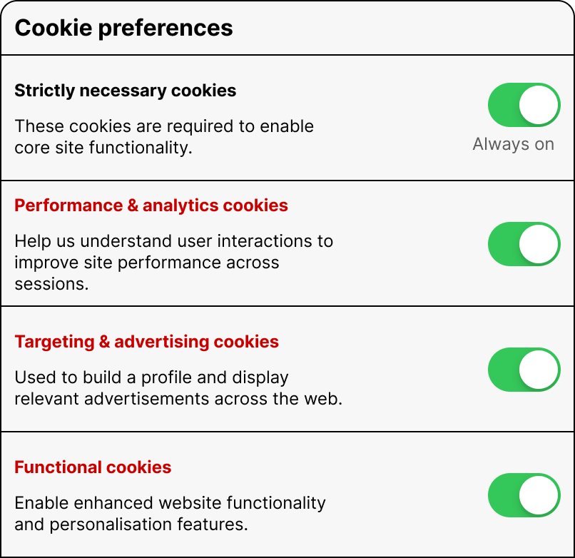
The copy alone has the power to create an environment of transparency and clarity for the user. However, the current writing style is heavily technical. Look at the difference between technical copy and user-centric copy below):
Current state (passive voice, zero clarity)
"We use cookies and similar technologies on our website to provide the service you request, and to aim to offer you the best website experience possible."
Note: Look at the Samsung screen for a scary copy example.
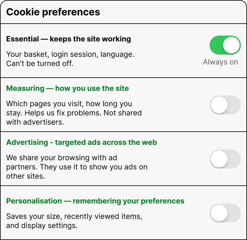
Desired state (active voice, honest and communication)
"We use cookies. Some are essential — the site won't work without them. Others track how you use the site to show you targeted ads."
Note: I asked Claude to take the first current state copy and rewrite it so that the user can understand what they are agreeing to.
Managing preferences should be stress-free
Content should create context, not confusion.
Jargon-heavy content creates a transparency problem. The conventional copy bakes deception into the structure, perhaps without meaning to.
Technical writing is not the problem. Forcing technical writing into a non-technical space is. “Enable enhanced website functionality and personalisation features” is an accurate description of what the Functional cookies do, for a developer or a BA. Not for Jim, who’s trying to bulk buy golf balls.
To conclude, here’s what the present copy looks like when managing preferences (this is a nice version) and also how I would write the copy.
Current state: by technical people, for technical people
Current state: human-centric copy
If you’d like to have a conversation about how user-centric copy can make tangible improvements to the user experience, you can book a call through this link:
https://calendly.com/sharmapulkitmukesh/30min or write to me at pulkit@pulkit.co.uk