
Not all heros are created equally.
Some can engage and convert users. Others leave the users confused.

This is a going to be a practical piece. I have picked six companies at random. This is an analysis of the hero sections on their websites.
Every modern website has a hero section. It is like the front page of a newspaper but, it has commercial impact on your business. It can get you leads, customers, and users. Or it can drive them away.
The purpose of the hero is create a strong first impression on the visitor. The product, service, industry, sector, audience… is all secondary. Here’s what makes a hero, a hero:
Clear intentional communication: the visitor should be easily able to understand what the webpage is about.
CTA (call-to-action): it invites the visitor to take a certain action. You choose the action. But, the hero section is the door to your entire website. You cannot present a door without a path to lead to.
Clear communication and a call-to-action is what we will assess the companies on. If you disagree with any of the assessments, feel free to drop a comment or write to me at pulkit@pulkit.co.uk .
Company: Tagomics
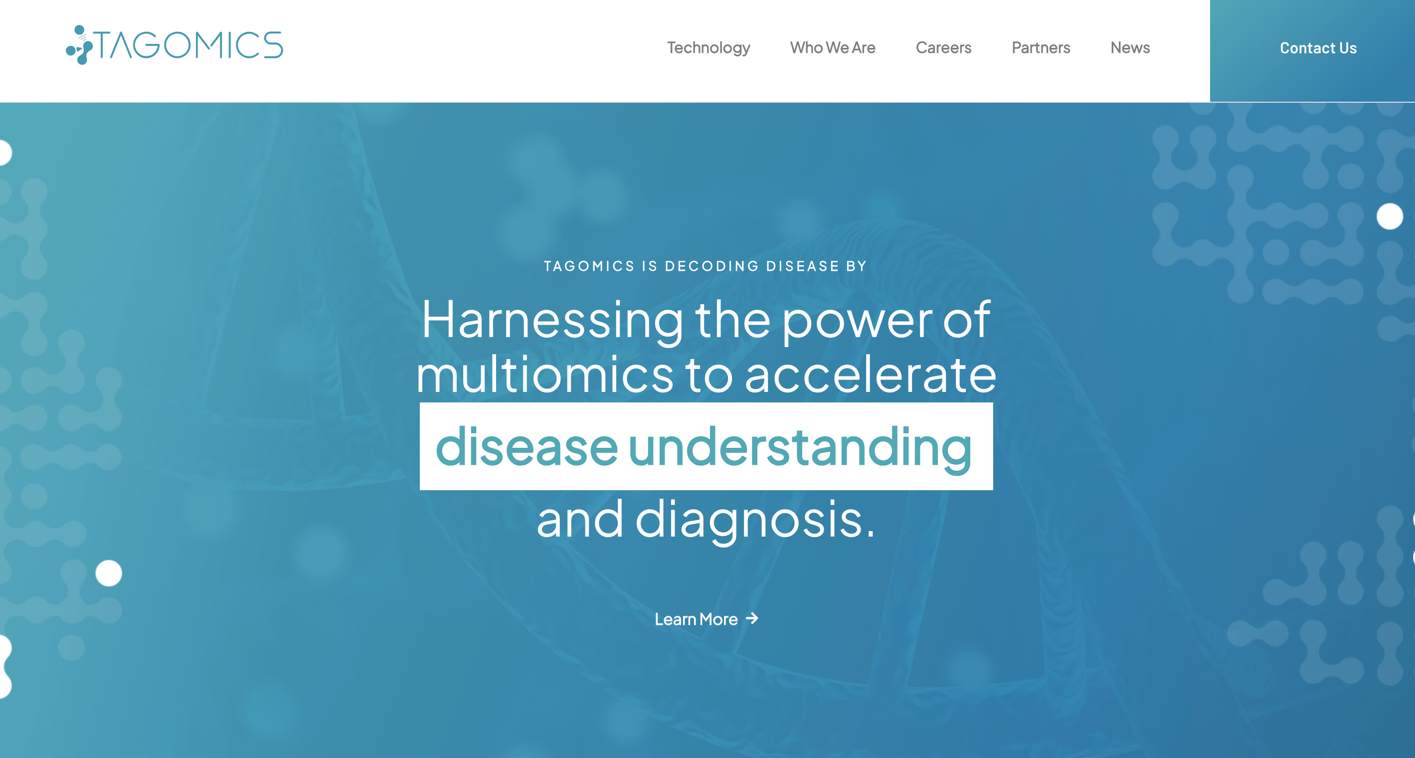
Clarity and intent (8/10): Tagomics, by the looks of it, is a med-technology company. They are using technology to improve disease understanding and diagnosis.
CTA (5/10): There’s a “Learn More” button. However, the copy could have been designed to continue communicating with the user. For example: “Ready to see how mutinomic profiling is transforming disease diagnosis? Learn more”. There is definitely space for a sub-heading.
Yes, you might have an ICP (ideal customer profile). But, you could also have customers who are a weak version of the ICP or an adjacent profile. Your ICP knows exactly what you do. But, those other profiles might need a bit more information. Your hero can either be a door that lets all those passing by see what’s inside, and make their own decision. Or it can be a door that is only opened by those who know what to expect inside. It’s your choice.
Company: 4d Medicine
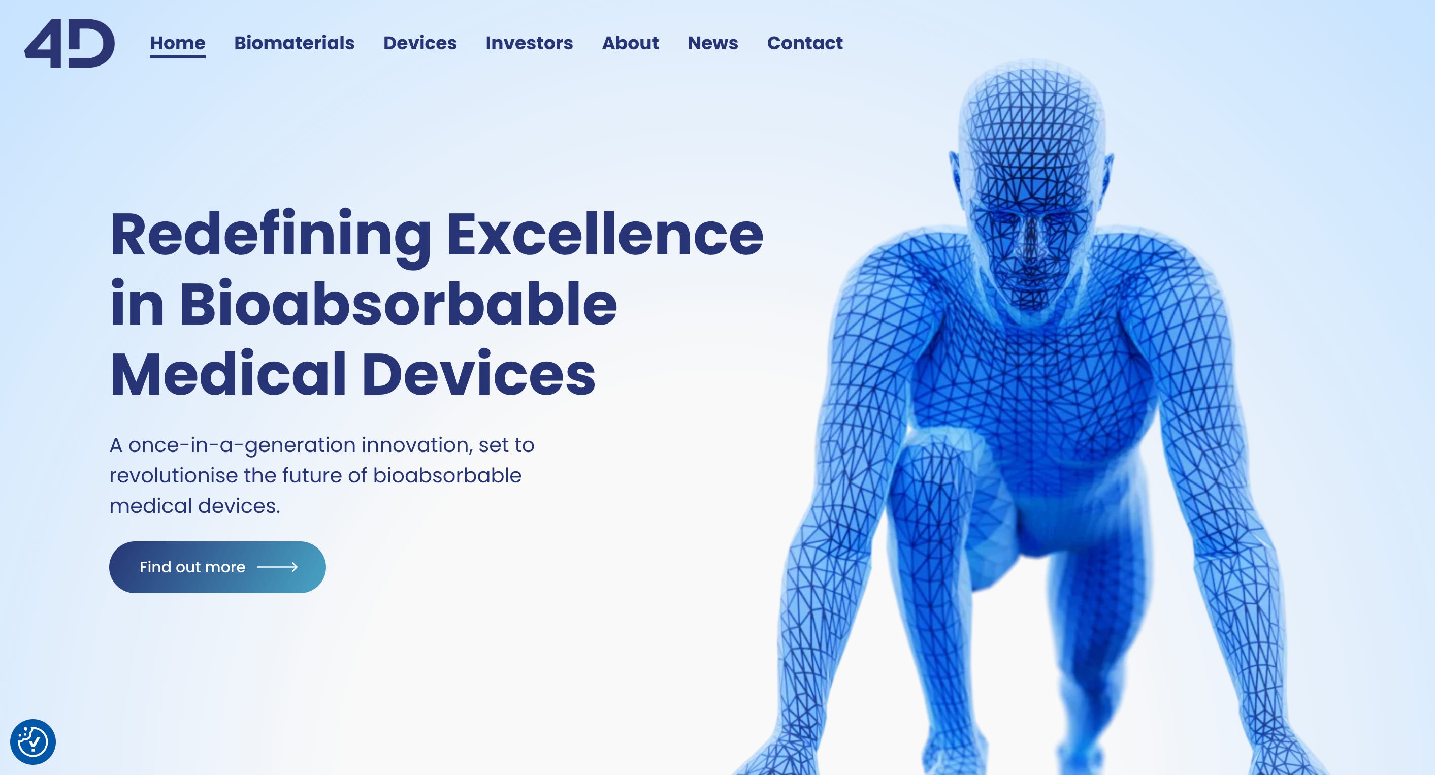
Clarity (7/10): Another med-tech company. This time, we have a heading and a sub-heading. The heading is clear and the sub-heading continue build the vision. Though it does not deepen the narrative in any way. The visuals are clear and I don’t think there would be any issues on the accessibility front.
CTA (5/10): Clicking on the CTA, leads to the “Devices” section. Why not use the sub-heading to shift the conversation towards devices instead of continuing to build the macro view. It’s generic. But, the sub-heading should have been used to mention 4Degra© biomaterial…. which is evidently at the centre of their offering.
You do not leave a user journey to chance. When designing a website (or any other product) it is up to you to control how the user moves through and interacts with your product. The user only sees what you show them. Every word, every component, every element on a page must have a purpose.
Company: Salinity Solutions
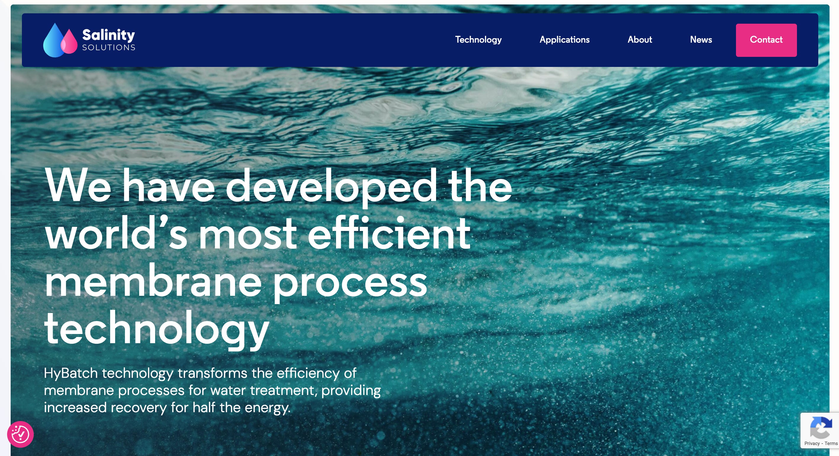
Clarity (5/10): Salinity Solutions have developed a water treatment technology and the USP is energy efficiency. But, I have to read the sub-heading to come to this conclusion. A quick browse shows that technology has a very wide application, from vertical farming to pharmaceuticals. But, the highly technical headline would only be clearly understood by water scientists. The company seems to have written the headline for themselves.
I can’t say that the readability is great, the image is not helping. The overlay should be darker, to create a separation between the text and the image.
CTA (0/10): There’s no CTA. So far, this is the company that seems to be ready for customers. They have a technology with a mass application. But, they are not inviting any visitor to get in touch with them.
Simplicity goes a long way. Your hero is the start of a conversation. Who would you rather speak with? The person who seems to talking in a code that needs deciphering. Or the person who can clearly communicate their point.
Company: Native Antigen Company
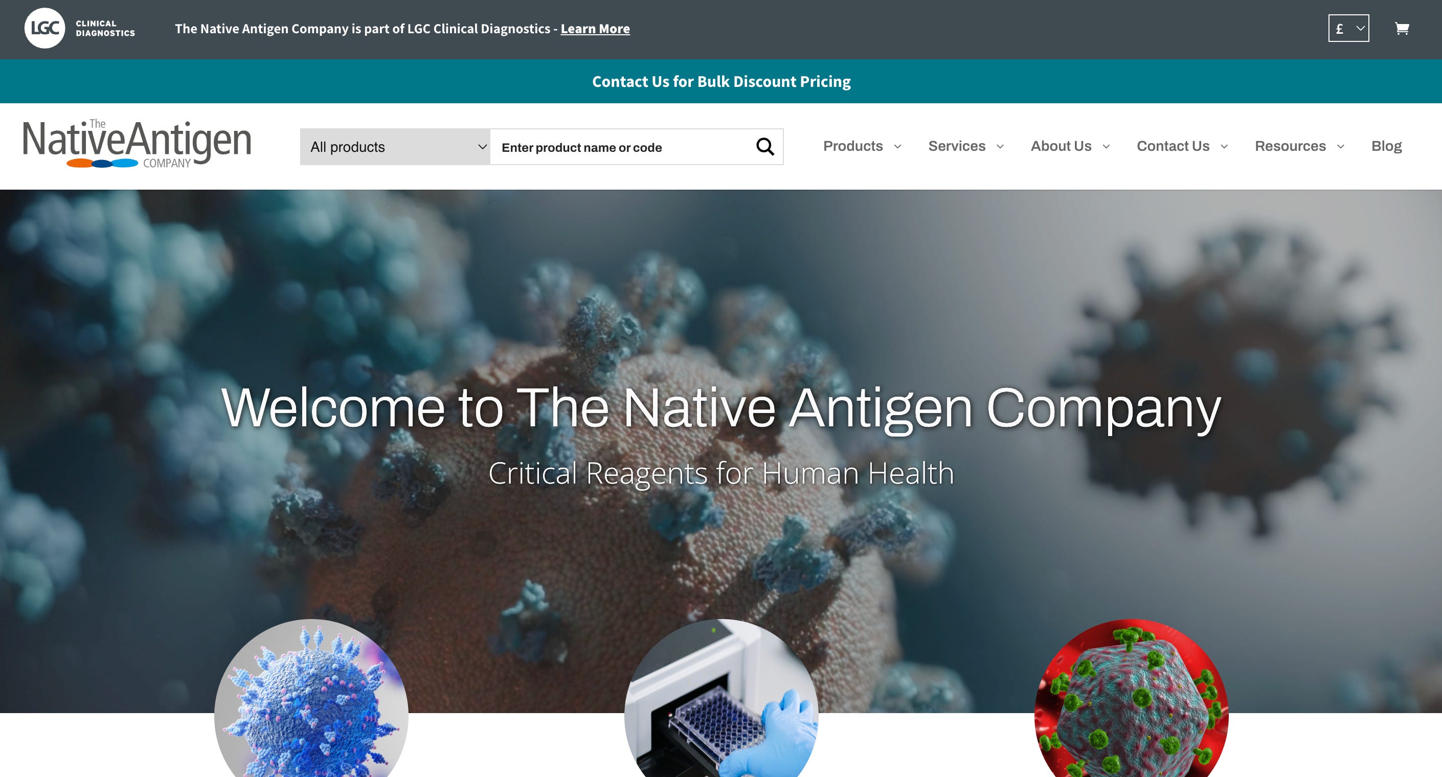
Clarity (1/10): “The Native Antigen Company develops and manufactures premium quality antigens and antibodies as well as offering a range of services to the diagnostic and biopharmaceutical industries.” - no part of the hero communicates this.
The hero that you see has three “slides”. Each has a video playing in the background. They make it difficult to read the content. Add to this the rather quick transitions, which make it impossible to finish reading the sub-headings.
CTA (0/10): The three circular images have CTAs. But, they are below the fold and not prominent. My hypothesis is that this company is missing out on a substantial amount of customers just because of the design of their hero section.
If it “looks good” but, makes reading and comprehension difficult: it’s no good. Ditch it. DO NOT prioritise aesthetics over usability.
Company: Dexter
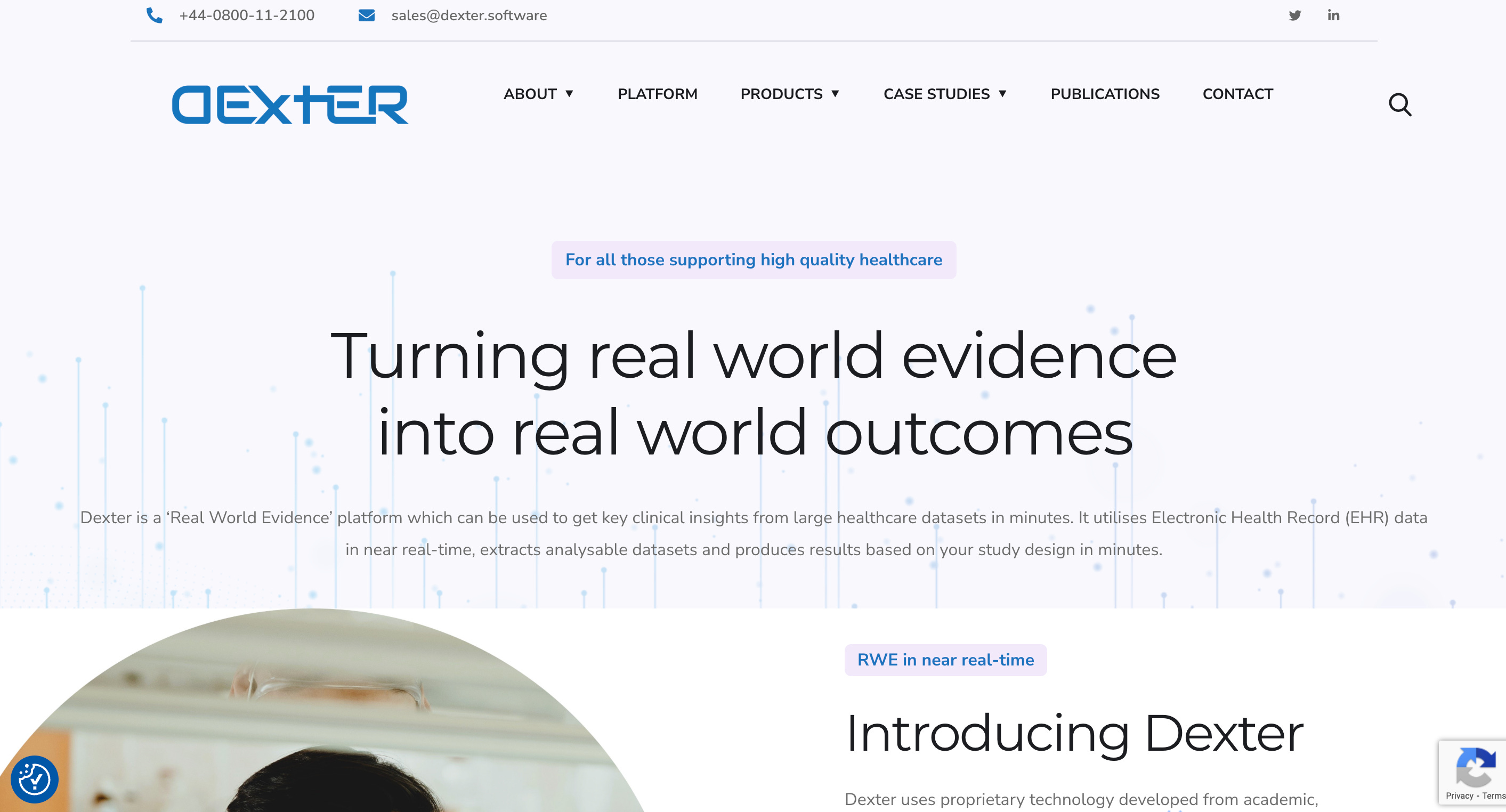
Clarity (5/10): Dexter is a big data analysis platform. The written content is clear. But, the readability is definitely compromised. The body text needs to be larger and needs a higher contrast. Compared to the NativeAntigen company, Dexter’s messaging is clear. They can now focus on the aesthetic elements.
CTA (0/10): By the looks of it, this too is an active platform. They have products ready to use. And, yet no calls to action. No invitation to book a free demo. No button to begin a free trial. A missed opportunity.
Company: Evophase
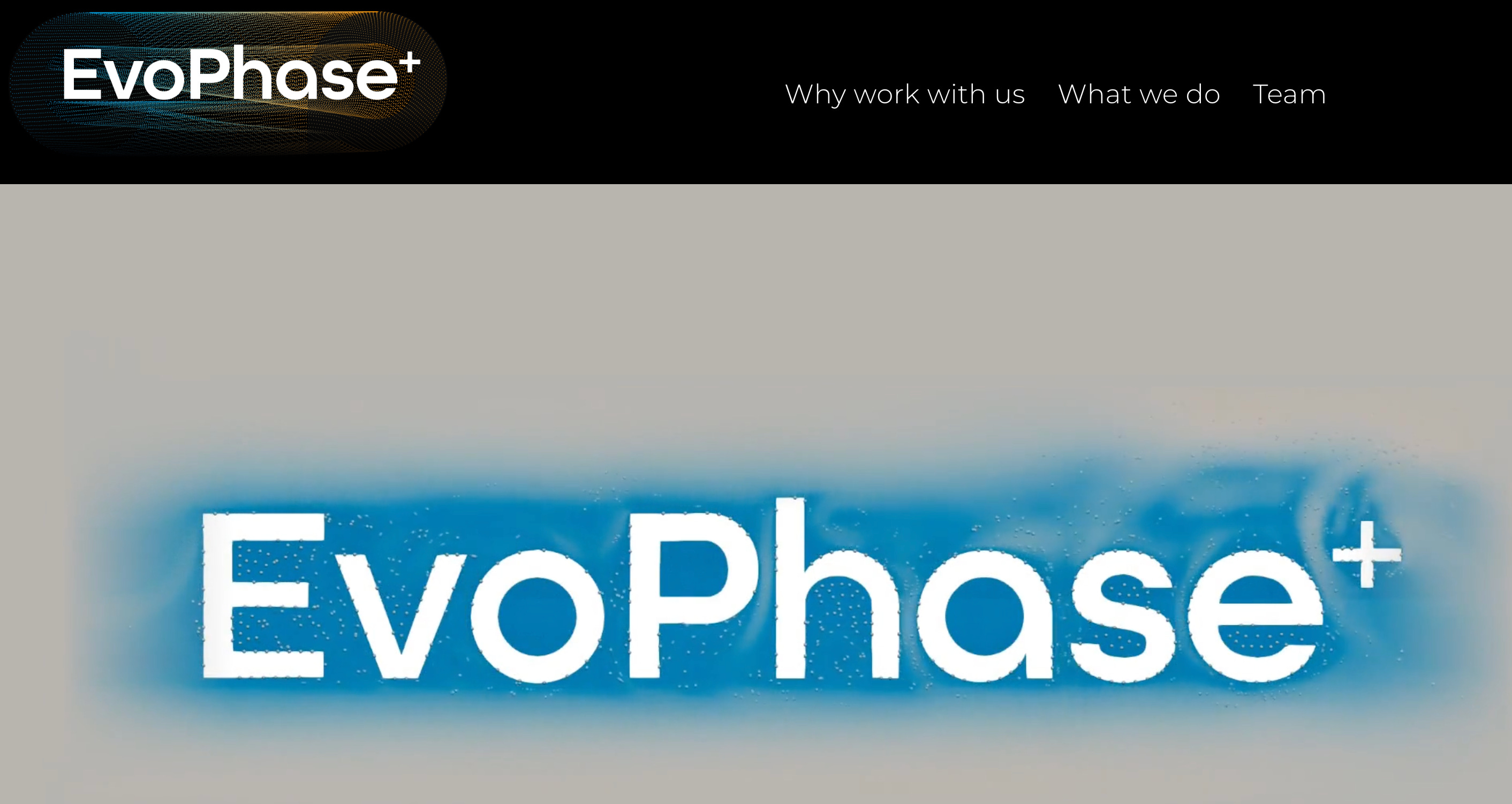
Clarity (0/10): This is genuinely exciting product. I don’t even work in manufacturing but, the potential excites me. But, the hero is a let down. The beautiful animation does not matter, if I visitor cannot figure out what the offering is.
CTA (0/10).
Feel free to visit the website yourself and validate my scores.
Intention. Direction. Outcome.
If there’s anything you create that will be seen by other people, it must be intentional. The who, what, when, why, and how are all in your control. If you are an entrepreneur or a business leader, there are a thousand things that are not in your control. The user experience that is delivered through your website and especially the hero section, is in your control. You control the narrative. Don’t give it up to chance.
Think about what you want your visitor to do and then design your copy accordingly. Any imagery or graphics should only elevate whatever it is that you are trying to communicate, and not clash with it. Craft a call-to-action that will drive the user to do what you wanted them to do.
If you’d like to take control of the user/customer experience for your product or service, book a free 30-minute consultation through this link.
Support this publication through “Buy me a coffee”!
BONUS: two strong heros (from Mobbin)
Use this referral link to get a 10% discount on Mobbin, the greatest library of digital products and user flows.
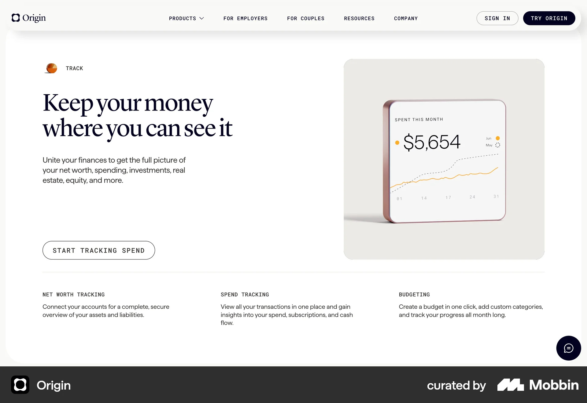
Origin’s copy is clear and the CTA communicates the core benefit. A perfect blanace between form and function.
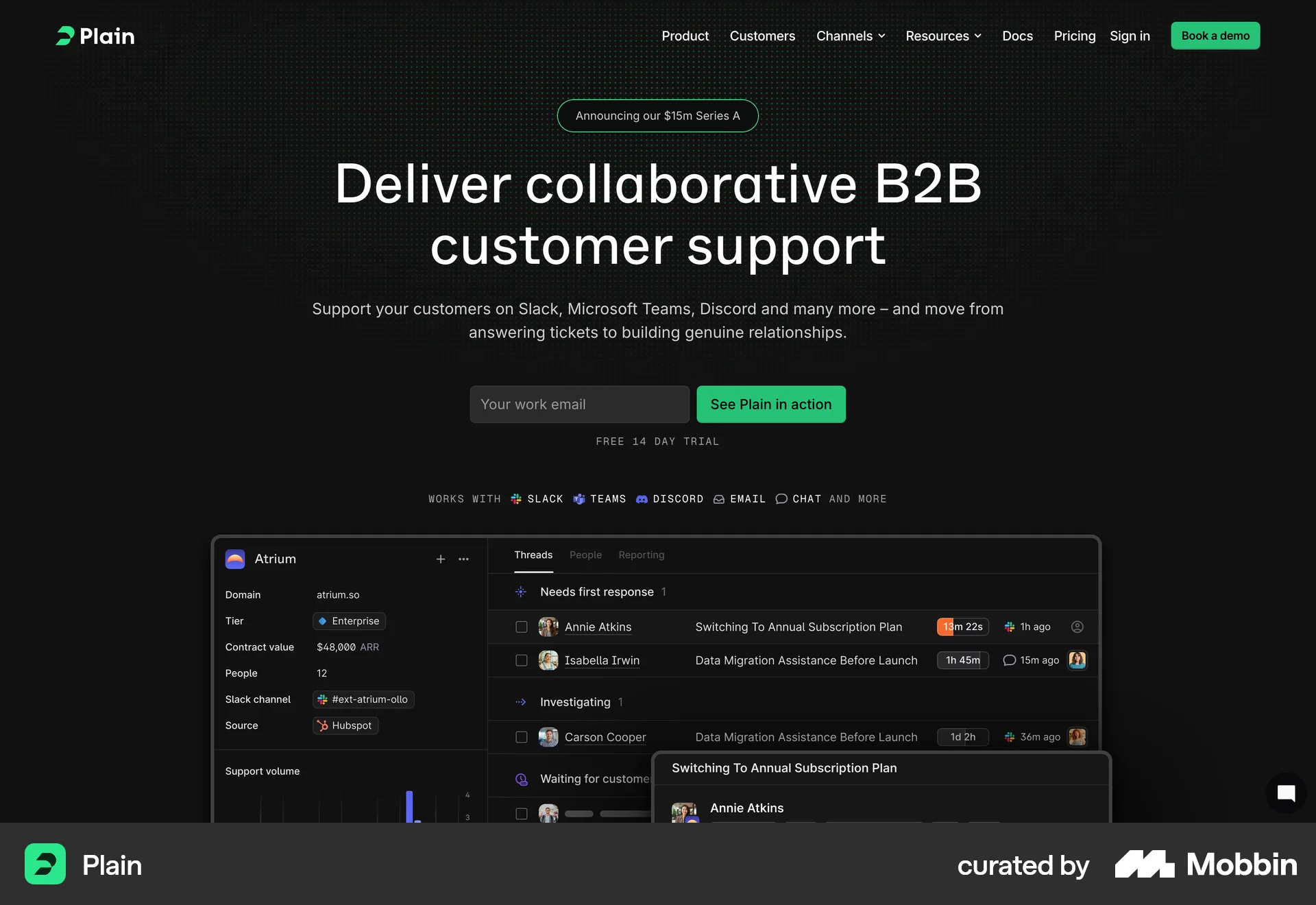
This type of hero leads you to the CTA. Plain’s CTA invites you see the product in action. A free trial is a powerful thing. It build trust. But, if you offer it and don’t communicate it, there’s no benefit for anyone involved.