
Using Ai to improve a leaflet
Being too close to something makes you myopic (short-sighted)

I recently started teaching music. The first step was to get the word out. Now, I know my target audience. Instagram pages and TikTok reels don’t quite matter as much at this point. It will matter when I want to grow, but it’s not essential at this point.
At this point, they need a leaflet. An artefact that can be shared easily on WhatsApp or over email. Something that
Is easy to read and consume.
Clearly communicates what I teach.
Explains the rates.
Version 1: The design vomit
I had a small concert coming up. It would be a good platform to start the marketing effort. I put together a two-pager and then generated a QR code that could be scanned to access the leaflet.


I took this to the concert. But I wasn’t happy. When someone opened it on their phone, I could see the amount of effort it took for them to read.
I was forcing them to think.
There was too much friction.
I am not a visual designer, and it showed. These were just notes that had been tidied up and made to look like a leaflet.
Version 2: Just a single page
There were two main bits of feedback from the concert about the leaflet.
Too wordy. I could see the effort it was taking someone to read it on their phone. I could see them scrolling up and down.
A lot of people asked about the rates. This had not been mentioned on the leaflet. I had identified it as a top requirement and proceeded to exclude it.
Note: economists base their models on humans being rational. Which rational being defines a requirement and then doesn’t implement or solve for it?
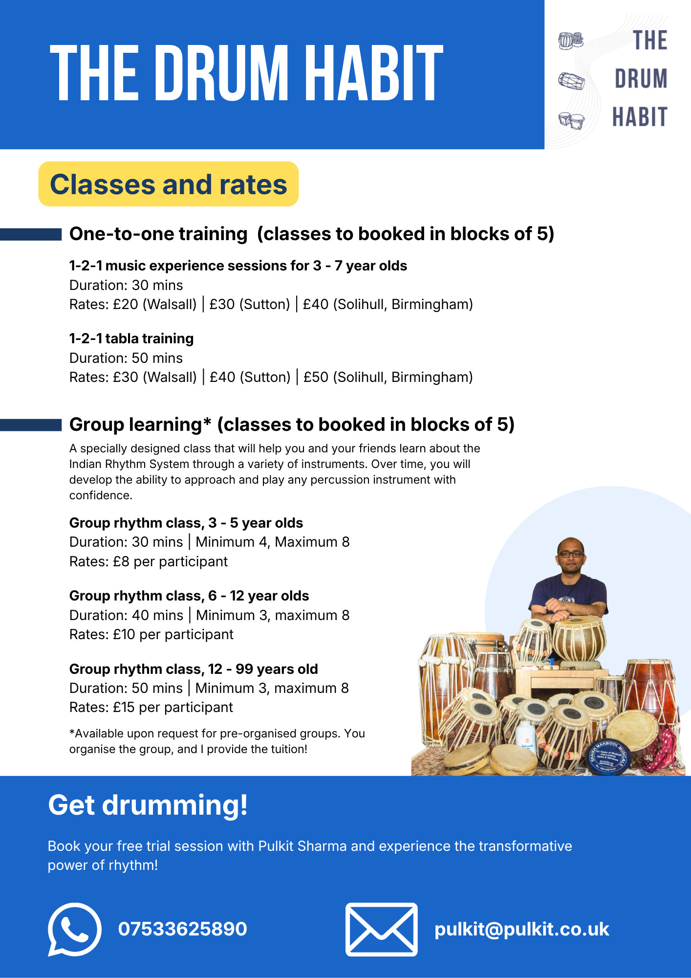
This version used context to communicate what I do. The title, logo, and the image of me and my drums let the reader know that this leaflet is about music lessons.
The body is all about the lessons and the rates.
But, once again, too much text. I still had people ask me how much I charge per lesson.
Though the right content was present, there was just too much information being shared.
I knew I needed to make another iteration, but I was stuck.
Version 3: External help
I fed my leaflets into ChatGPT. My prompt wasn’t great: “How do I improve these leaflets?”
This was one part of the response that really stood out to me as I started redesigning once more:
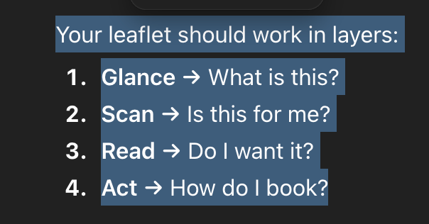
That’s how we consume something. The brain goes through all of these stages, and my job as the designer is to make each stage easy. I need the prospect’s brain to “slide” through these stages.
A few more prompts later, I had a clearer idea of how to improve the informational hierarchy and also reduce the cognitive load. The bot and I established that whitespace was an issue stemming from the copy. The text was too dense.
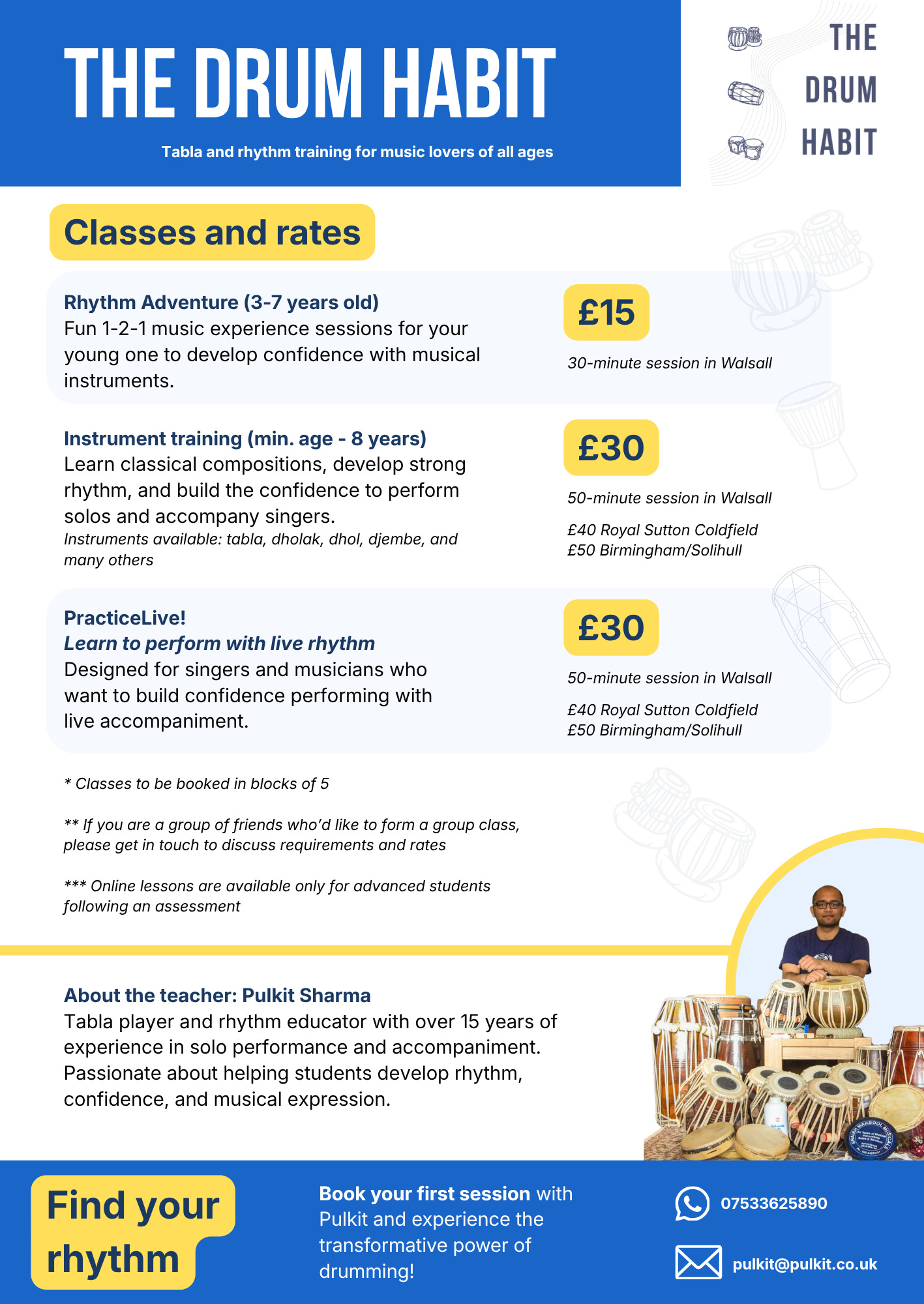
The new hierarchy makes scanning easier. The reduction in text density makes the reading experience more pleasant. The copy is better written. Fewer words, more focus on value communication.
Whitespace actually gives you the space to think. Packing too much into a limited space is not good: be it words on paper or clothes in a suitcase.
I will now be going live with this version. The copy still needs to be improved. I think bullet points will be much more effective in improving the reading experience in this case.
This journey is about making it effortless for someone to say “yes.”
It continues.
If you’d like to have a conversation using AI as a co-creation partner, you can book a call through this link:
https://calendly.com/sharmapulkitmukesh/30min or write to me at pulkit@pulkit.co.uk